Best Sellers
Best Seller
New
Best Seller
Best Seller
Best Seller
New
Best Seller
New
Best Seller
New
Best Seller
New
Sold out
Best Seller
New
New
New
Best Seller
New
Best Seller
Best Seller
Best Seller
New
Best Seller
Best Seller
Best Seller
New
Best Seller
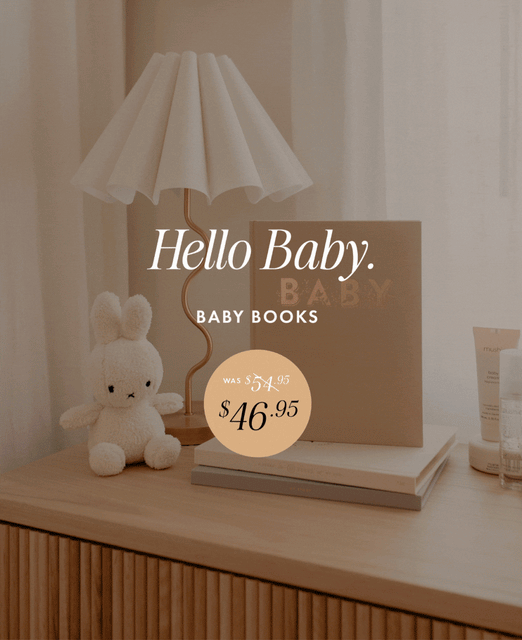
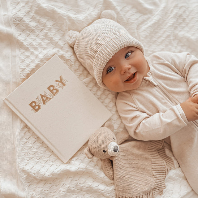
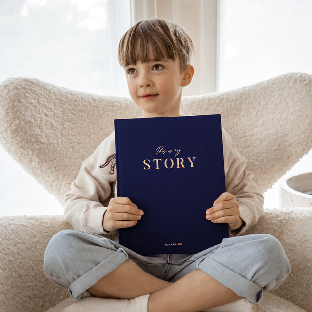
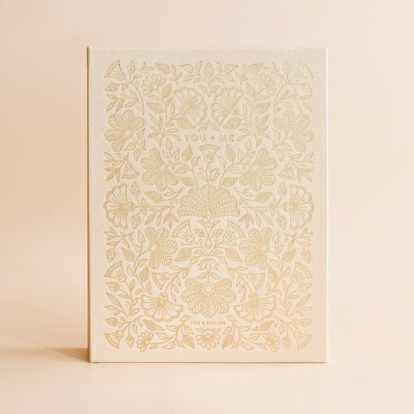
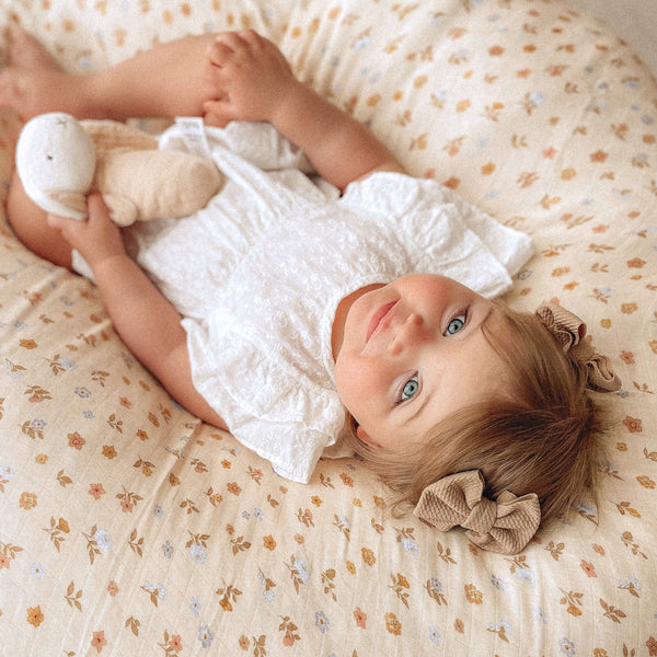
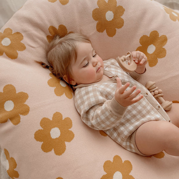
Beautiful keepsakes for life's big moments.
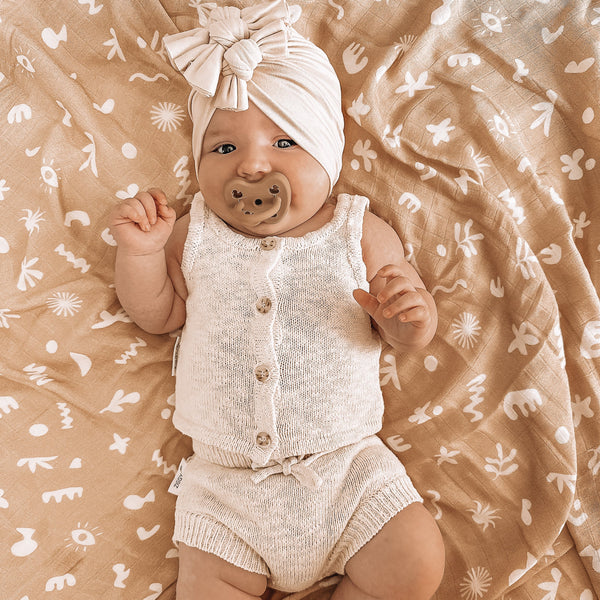
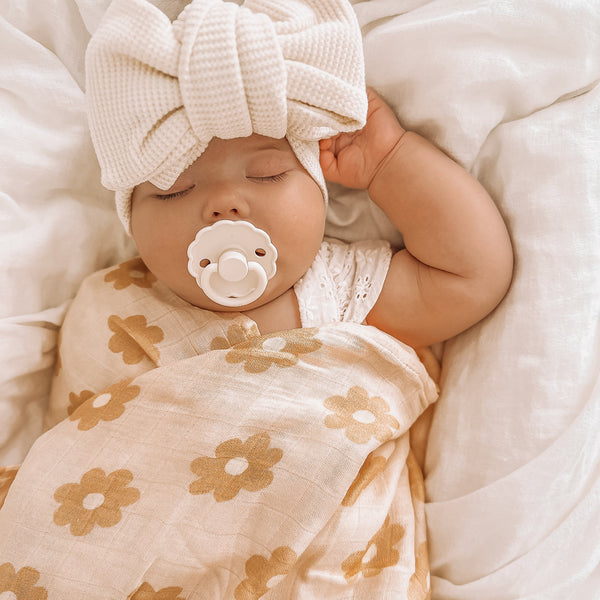
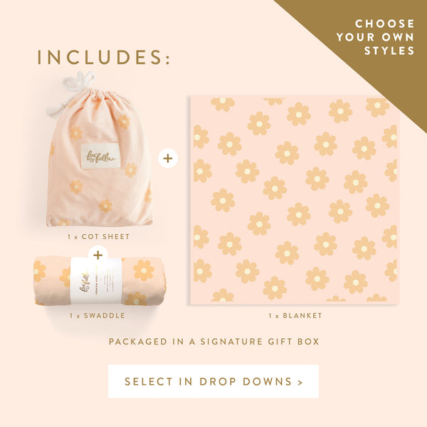
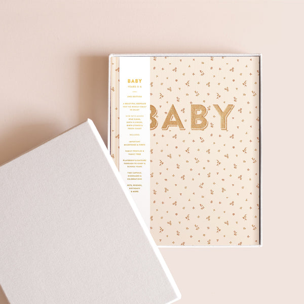
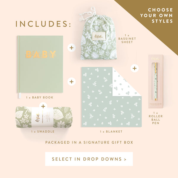
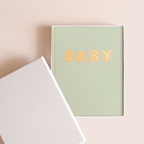
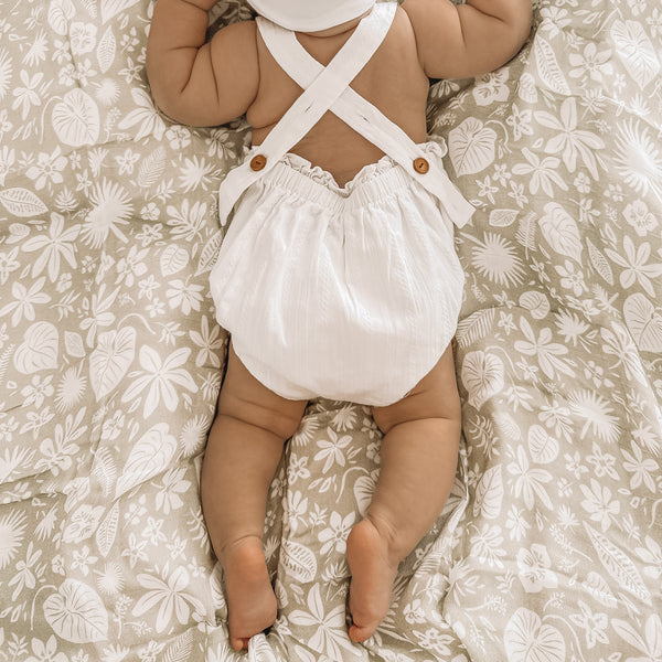
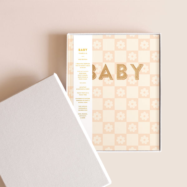
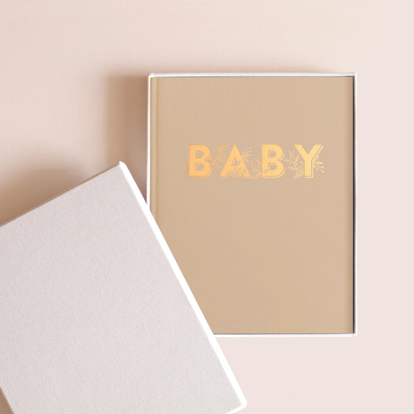
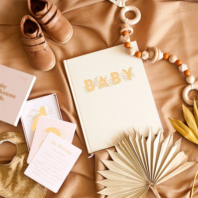
The Baby Collection
Discover the Baby Books and Baby Milestone Cards that everyone's been talking about. There's a reason they just keep selling out... more
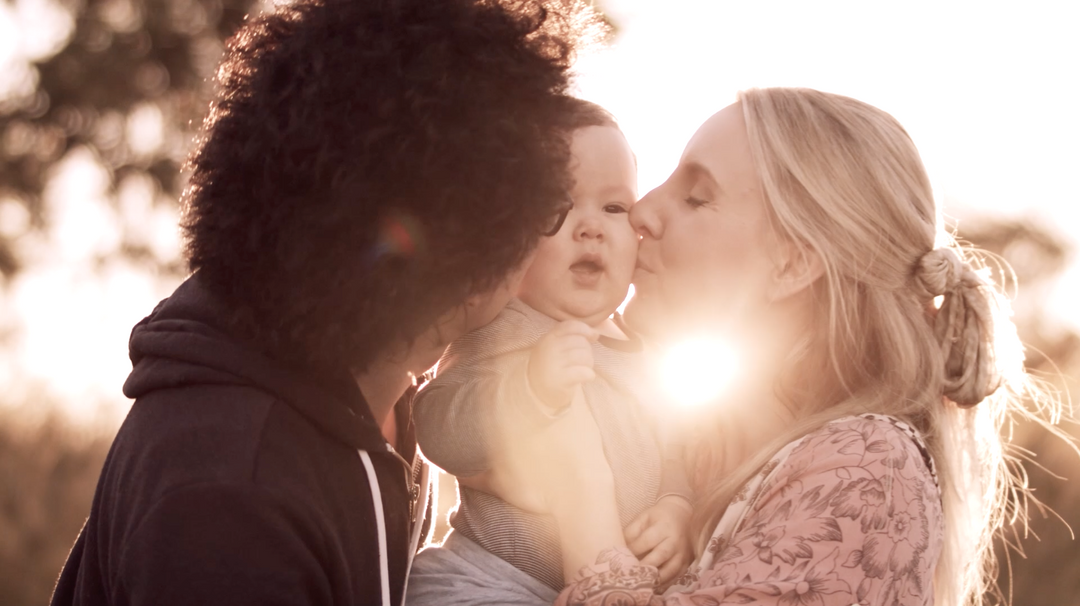
The Baby Book Video
The most beautiful stationery, baby, wedding and gifts.
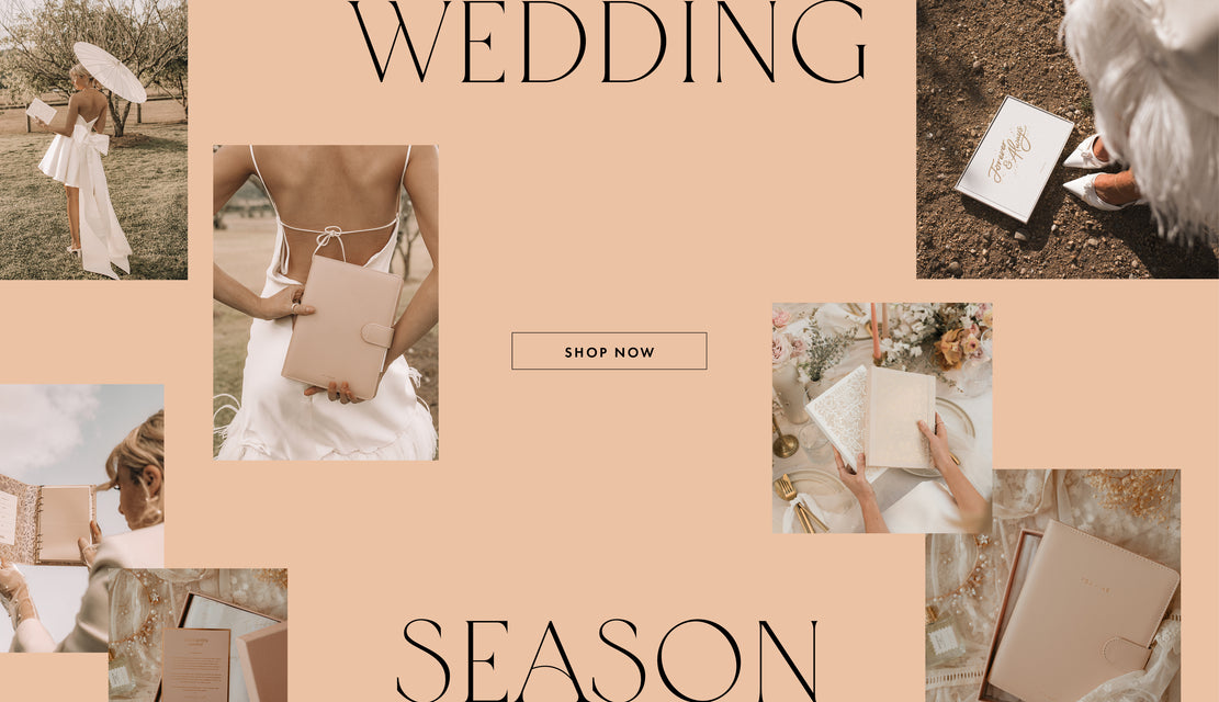
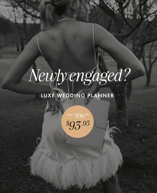
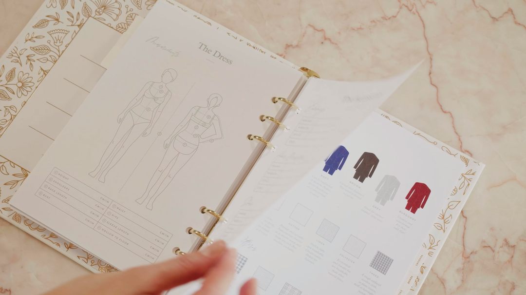
The Wedding Collection
A year in the making. Introducing the most comprehensive wedding planner on the market. Loved by over 30,000 couples. Discover the wedding planners that just keep selling out... more
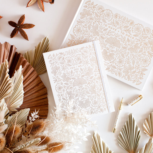
The Wedding Planner Video
Ethical. Sustainable. Australian.
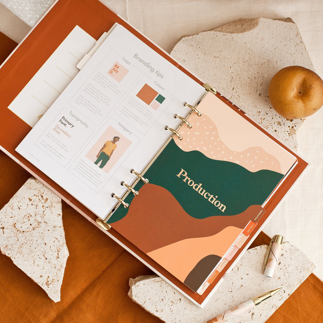
The Side Hustle Planner
The ultimate planner for your side hustle - whether you plan to keep it just as a hobby or grow it into the empire you’ve always dreamed of... more